

Who's Actually Earning Their Seat at the Table?
A Data-Driven Scorecard of Big Pharma CEO Performance


Last month, Sanofi announced that they would be moving on from CEO Paul Hudson and bringing on Merck KGaA’s CEO Belén Garijo to take over for him.
This change made me think a bit about Hudson’s performance relative to other CEOs, to figure out whether his ousting was warranted given his performance. In truth, I had forgotten that he had been in the role for as much time as he had (6.5 years). Going down that rabbit hole was interesting enough for me to expand this into a broader exercise examining CEO performance across a couple simple metrics.
So today we’ll take a quick look at the beginnings of this analysis. If it is interesting enough to you I’ll continue to build on this data set and add new layers (e.g. CEO pay/compensation, pipeline data, etc.) that will help uncover deeper insights into the relative performance of our sectors most impactful executives.
Overview of Methods
Before we get to the more interesting findings, I want to discuss the methodology: how I collected this data, what is included in the analysis, and the current limitations.
First off, this dataset is comprised of 23 different CEOs spanning companies including AbbVie, Amgen, AstraZeneca, Biogen, Bristol Myers, Eli Lilly, GSK, Gilead, J&J, Merck, Novo Nordisk, Novartis, Pfizer, Regeneron, Roche, Sanofi, Takeda, Vertex, Bayer, and Merck KGaA.
The dataset looks at each CEO from their starting point all the way through to today. For certain companies—particularly ones like AbbVie, Novo Nordisk, and GSK that have had CEO changes during that period—I try to capture data from both CEOs individually. For CEOs who are new to their roles, they obviously won’t have as much data to go off of. For the most part these CEOs were excluded from substantive analyses. For Regeneron’s CEO, Len Schleifer, I had to start his data from 2012. This is partly because if I started it from 1988 when Regeneron was founded (or even 1991 when Regeneron IPO’d), it would make the data look a little wonky, but also because it was impossible to find correct financial data from back then.
Quantitative Data
The main pieces of data I collect, examine, or generate are:
Market Cap: While not a perfect metric, how much a company grows or shrinks during a CEO’s tenure serves as a rough quantitative barometer of their performance.
Tenure Milestones: I captured the market cap on the beginning date of each CEO’s tenure, as well as on their last day (or current day, if they are still in the role).
Intervening Data: I collected market cap data at the end of each intervening year during their tenure
Value Created and absolute growth percentage: This measures the raw growth in market cap from start to finish for each CEO.
Compound annual growth rate (CAGR): functionally ignores yearly fluctuations and calculates a “smooth” rate of return of market cap growth or decline for each CEO’s tenure.
Certainly there were other metrics that we could have looked at—and I hope to layer these in for future analyses—but some limitations here are that I didn’t look at things like EBITDA, EPS, other profit metrics, or revenue growth. Those are all things that I hope to include in the future, but for simplicity on the quantitative side, I focused really just on market cap.
Qualitative Data
Qualitatively, I tried to capture a few different things. Obviously, CEOs don’t take over brand-new companies; the case of Regeneron aside, most of these CEOs are taking over companies that are dozens of years old with a previous track record and history. Not every CEO is dealt the same starting hand, so to speak.
For each CEO, I tried to provide a qualitative score of 1 through 5—what I’m calling a QHS (Qualitative Health Score). This is a highly subjective metric, but effectively, I tried to assess the forward-looking health of the business when the CEO stepped into their role and compare that to what the future outlook of their businesses looks like today (or at the time they ended their role as CEO).
To attribute a QHS score I looked several factors, including but not limited to:
Revenue and pipeline diversification (or over-concentration)
External and internal sentiment about the company
Sales trends for major products
Patent cliff risk and sufficiency of maneuvers to delay or fill them
Pressure to execute M&A, major deals completed, and where possible, the success or shortcomings of those deals in contributing to revenue growth
Major outliers in the balance sheet (e.g., companies carrying lots of debt)
The goal was to effectively provide a a “vibe check” for the compare right before the CEO took office and what that vibe looks like today.
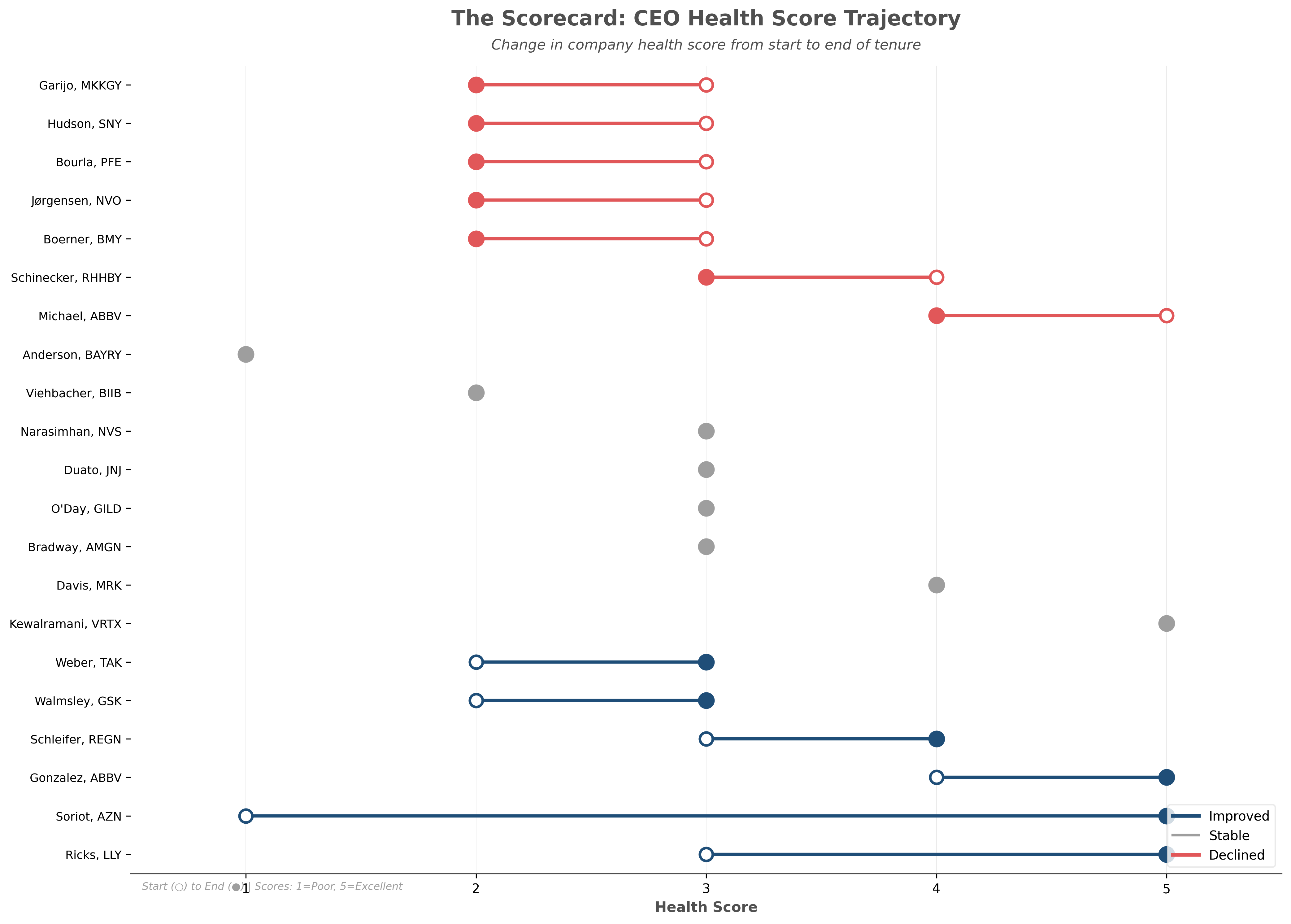
The larger table above includes information that you can read through, discussing my determinations of what the company state was at the start, as well as the rationale for the QHS score change. However, this scorecard, so to speak, does a more simplified job of showing you which CEOs improved, declined, or had stable QHS scores over the course of their tenure, based on my qualitative attributions.
Notably, most CEOs remained relatively stable in terms of their QHS scores. You had a range of cases here. Some cases like Bayer, which started off at a QHA score of 1 in overall pretty poor health and continued to stay there. Bayer, as we know, was saddled with a significant amount of debt following the Monsanto acquisition and was also tied up in a legal battle with several class action lawsuits related to Roundup. They had a declining pharma business and have struggled to generate growth, remaining “down in the dumps” while awaiting a turnaround.
At the other end, companies like Vertex—whose CEO, Reshma Kewalramani, took over a company with very bright prospects, especially in cystic fibrosis where Vertex is the unchallenged leader—continued to maintain a positive outlook for the company over the course of her tenure, including multiple late stage programs in new areas like pain, genetic medicines, cell therapy, and rare disease, thus far.
The biggest riser here, to no surprise, was AstraZeneca. Pascal Soriot’s story involves taking over the company when it was significantly beaten up and facing multiple patent cliffs for major products. He orchestrated a turnaround story that many other Big Pharma teams use as an example to follow.
The other is obviously Dave Ricks at Eli Lilly, who—largely because of the multiple successes in GLP-1-based assets—has now helped Lilly reach the status of being the first trillion-dollar healthcare company.
With that out of the way, let’s look at a few different data visualizations from this dataset and tease out some insights about CEO performance.
Charts! Charts! Charts!
I think the most digestible way to look at some of this data is by grouping the CEOs into cohorts. I organized their performances into these cohorts based on how much time they have spent in their role:
Short tenure: less than 4years
Medium tenure: 4 to 10 years
Long tenure: 10 years and over
